CTV Strategies
What media buyers need to know in 2024
Solutions
Connecting you to audiences, growth and new opportunities.
Featured product
Nielsen ONE
One clear view of your audience, brought together in one seamless platform.
Insights
Stay ahead of media’s evolution with our timely insights.
-
Featured
The Next Frontier
Your Guide to the 2024-25 Upfronts / NewFronts Planning Season
Discover the shifting media habits, surprising audience insights and new engagement opportunities that will shape the next year of programming.
Advertising18m read

-

Featured
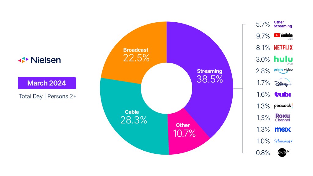
The Gauge
Navigate the TV landscape with precision. Examine audience viewing behaviors across key TV delivery platforms in a…
6m read
People
Real people are always at the heart of our data.
750K+
People around the world participate in our panels
Backed by real people, our global panels provide critical data validation and ensure representation.
13K+
Employees power our business globally
Our passionate workforce drives a better media future across 57 countries.
14
Business resource groups champion an inclusive culture
Members of these groups help us bring our best to the communities we measure.